My love for historic architecture fully launched when I was working in Chicago over a decade ago. I worked downtown and was surrounded by modern and beautiful skyscrapers, but would go home to my one bedroom apartment, on the top floor of a historic building that was once a hotel and was converted into apartments (The Beatles had even stayed there back in the day). The apartment felt like “home” with its thick and intricate moldings and millwork made of real wood, its old elevator and lobby that took you back in time, and the grand two-story arched windows that looked out onto the lake. The attention to detail, to not only make something functional, but beautiful, was an architectural trait I feel they truly mastered in the late 1800s and early 1900s. In this building, and my apartment, is where I found my love for interior design, and my love for historic homes.
Fast forward fourteen years, and I have the privilege of helping my clients bring their homes to their fullest potential, working as an interior designer at my firm, Belinda Pabian Interiors. When given the opportunity to work on a historic home, I like to first focus on its best assets and make sure those are not lost, but highlighted. Then, I like to assess the function and find solutions for anything that isn’t “working”. With that, I introduce this 1920s Dutch Colonial. In this column, I’ll take you through the home’s renovation, and how we kept the traditional-feel alive, while making it function in today’s modern world.
This home was filled with potential. The exterior architecture felt like that out of a Nancy Meyers movie, or something you would see when flipping through Better Homes and Gardens with its dutch roofline and symmetry. It just needed to be brought back to life, and I saw the potential.
I’ll start by saying, I’m not always a fan of painting brick. In fact, I think it’s most often not the right decision. It can’t be undone, and oftentimes there are other avenues to play up the curb appeal. But, when I saw this home, I knew it would shine with a fresh coat of a milky white paint color that wasn’t too stark. It needed to feel historic, like it had always been this color. Next, I wanted to add dimension - so up went two flower boxes on the first floor and black shutters on the second floor for added contrast. The roof was replaced, as well as new gutters, new windows, new exterior lighting, and house numbers made of real cast iron. The landscape brought in the classics, like boxwood and hydrangea.
This exterior refresh now pops on the street, surrounded by the lush green foliage in the spring and summer, and looks beautiful with a blanket of snow in the winter. What I love most is that it’s a seamless transition when you move into the interior. More to come on that as we continue to work though the home’s renovation, which all feature traditional design, with a twist.
Visit belindaplabian.com for more information.
This article originally appeared in the March/April 2025 issue of Omaha Home Magazine. To receive the magazine, click here to subscribe.
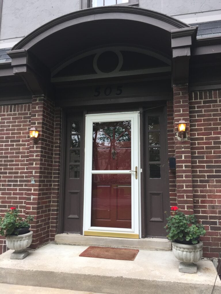
Photo by Mandy McGregor.
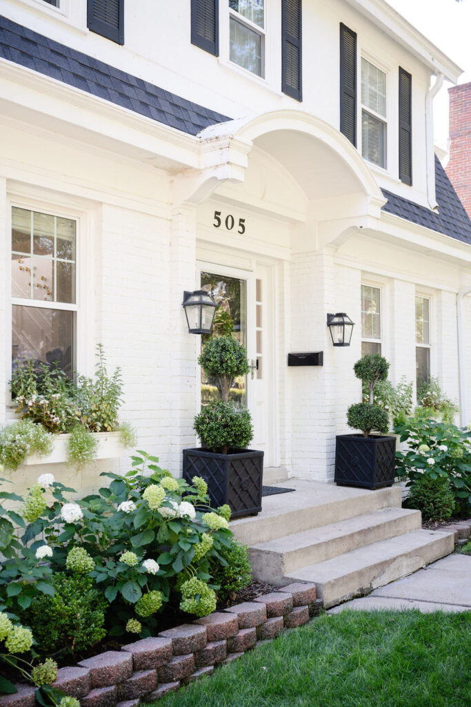
Photo by Mandy McGregor.
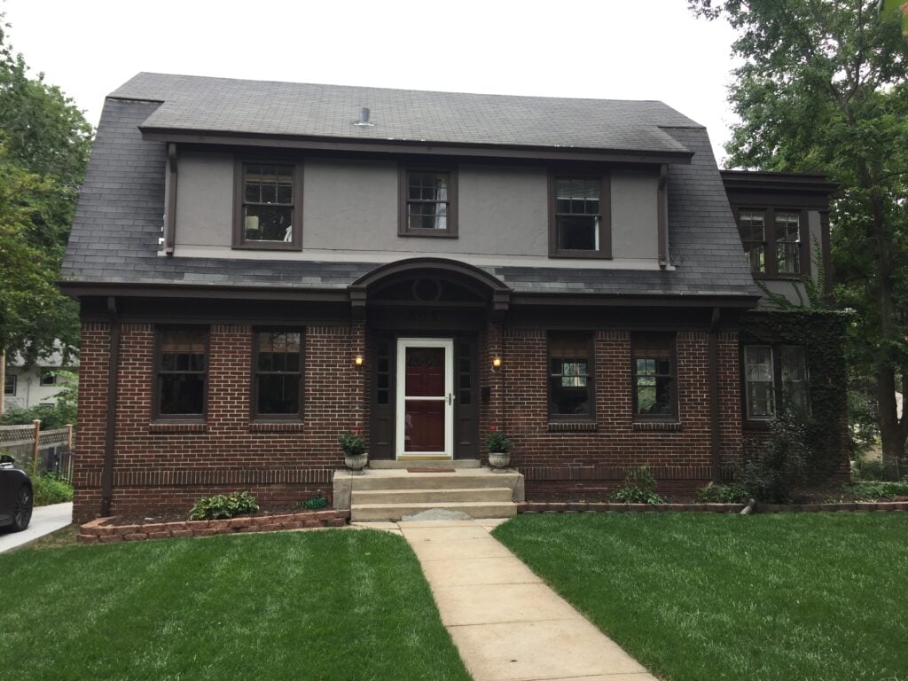
Photo by Mandy McGregor.
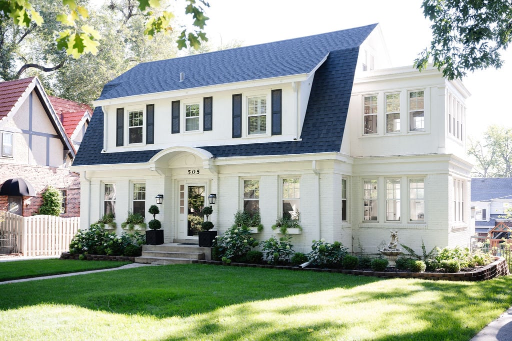
Photo by Mandy McGregor.
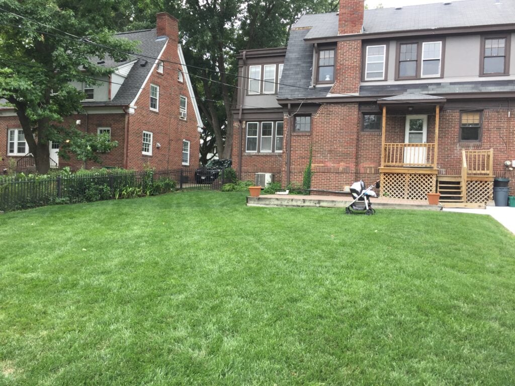
Photo by Mandy McGregor.
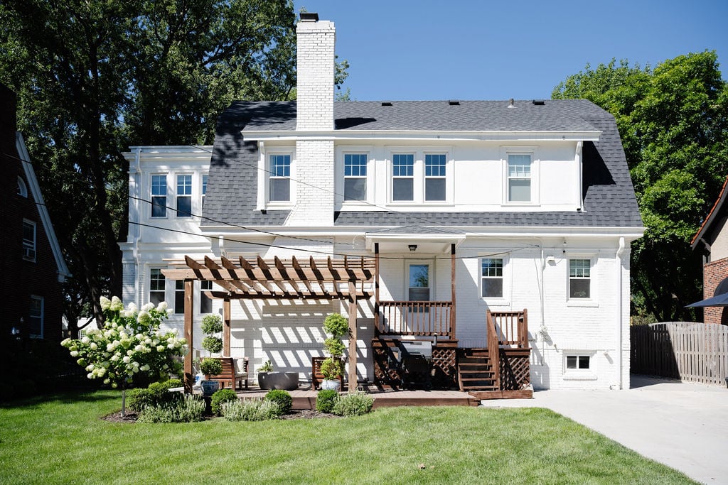
Photo by Mandy McGregor.